Welcome to the day 21 project in the 30 Days of Python series! Today we're going to be building a multi-file application that allows users to create graphs (or charts) for our flower data from day 14.
A lot of the work we'll be doing revolves around structuring our application well so that we can develop it easily. However, we also need to learn how to create graphs! For that, we'll be using the matplotlib module. Specifically, the pyplot submodule, which makes drawing simple graphs easy!
Before we talk about the project brief, let's cover how to create a simple graph using matplotlib.pyplot.
Also remember we've got the video version of the walkthrough available.
Plotting graphs
There is a lot to learn about matplotlib.pyplot, but fortunately for us, getting the basics down and creating some simple charts and graphs is fairly straightforward.
The first thing we'll want to do to start working with pyplot is import it. I recommend importing it like this:
from matplotlib import pyplot
If you are using repl.it, this should work automatically. If you are running Python in your own computer, you'll have to install matplotlib in order for this to work. One of the benefits of using repl.it!
You can find an installation guide here.
Now that we've got access to pyplot, we can use it to draw a graph.
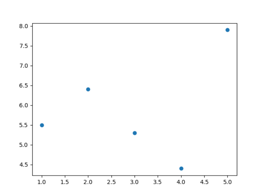
For our data set we will use a scatter plot, which looks like this:
 Here's how we can draw a simple scatter plot with
 pyplot:
from matplotlib import pyplot

x_data = [1, 2, 3, 4, 5]
y_data = [5.5, 6.4, 5.3, 4.4, 7.9]

pyplot.scatter(x_data, y_data)
pyplot.savefig("graph.png")
If you type that out and run it, you'll see that a new file appears in your repl.it project called graph.png. That is the image file that contains the output of pyplot.
Other than importing pyplot, what we've done is:
- Define the x and y values to plot.
- Tell
pyplotto use that data to draw a scatter plot. - Tell
pyplotto save the output generated to a file.
Values to plot
We've defined x_data and y_data, two list variables. Each contains 5 values.
When creating a scatter plot, pyplot takes the first value of x_data and the first value of y_data and draws a small circle in their designated location. Then it repeats for the second value, and then the third.
Therefore, x_data and y_data must be the same length. Otherwise you might end up with some points that have an x position but no y position!
Defining the axes
Notice that we never told pyplot how large the axes should be. It automatically calculated the size of each axis based on the maximum value plotted.
pyplot can do this if the values we're plotting are numbers. It can't do that if we plot strings, because it doesn't know how to get the maximum value of a list of strings.
Creating multiple graphs
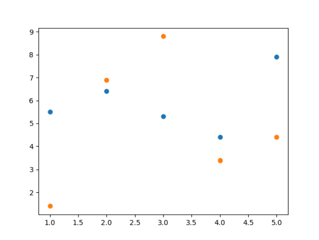
When you get to the point of asking the user over and over to create new graphs and new files for them, you may run into a problem: pyplot by default will add new data points to the existing graph instead of creating new graphs.
If we run something like this:
from matplotlib import pyplot

x_data = [1, 2, 3, 4, 5]
y_data = [5.5, 6.4, 5.3, 4.4, 7.9]

pyplot.scatter(x_data, y_data)
pyplot.savefig("graph.png")

y_data = [1.4, 6.9, 8.8, 3.4, 4.4]

pyplot.scatter(x_data, y_data)
pyplot.savefig("graph.png")
The file graph.png will only exist once, because we overwrite it. However, it will contain the data for both y_data variables, like so:
 That's because by default,
 pyplot creates one figure: one place to draw the chart.
If we want to create separate charts each time, we must tell it to create a new figure before creating the chart:
from matplotlib import pyplot

x_data = [1, 2, 3, 4, 5]
y_data = [5.5, 6.4, 5.3, 4.4, 7.9]

figure = pyplot.figure()
pyplot.scatter(x_data, y_data)
figure.savefig("graph.png")

y_data = [1.4, 6.9, 8.8, 3.4, 4.4]

figure = pyplot.figure()
pyplot.scatter(x_data, y_data)
figure.savefig("graph.png")
By doing this, pyplot creates a new figure and automatically "selects" it. Then when we .scatter(), it draws on that figure. Then we do figure.savefig() and that creates the image file.
The brief
As we develop this application, remember that to plot a scatter chart we just need the x and y values we want to plot. Most of the code we'll write will be concerned with getting that data, so we can chart it easily with just a few lines of code.
First of all, you may want to create a file and call it iris.csv. Make it contain the following data:
sepal_length,sepal_width,petal_length,petal_width,species
5.1,3.5,1.4,0.2,Iris-setosa
4.9,3,1.4,0.2,Iris-setosa
4.7,3.2,1.3,0.2,Iris-setosa
4.6,3.1,1.5,0.2,Iris-setosa
5,3.6,1.4,0.2,Iris-setosa
7,3.2,4.7,1.4,Iris-versicolor
6.4,3.2,4.5,1.5,Iris-versicolor
6.9,3.1,4.9,1.5,Iris-versicolor
5.5,2.3,4,1.3,Iris-versicolor
6.5,2.8,4.6,1.5,Iris-versicolor
6.3,3.3,6,2.5,Iris-virginica
5.8,2.7,5.1,1.9,Iris-virginica
7.1,3,5.9,2.1,Iris-virginica
6.3,2.9,5.6,1.8,Iris-virginica
6.5,3,5.8,2.2,Iris-virginica
After we've completed this project, feel free to experiment with other data sets too!
For this project users should be able to:
- Create a scatter plot where the
xaxis is thespeciesand theyaxis is one of the other columns. - Via a user menu, tell us the column they would like to plot in the
yaxis. - Also via the menu, tell us the name of the file they would like to create to contain the final plot image.
I would recommend tackling this project this way:
- Use the file
[main.py](<http://main.py>)to contain the user menu. - Create a file, such as
data_storage.py, that contains functions to read theiris.csvdata file. - Create a third file,
graphing.py, that contains a function that creates the scatter plot given thexandyvalues.
Our solution
Defining the user menu
We will have a simple user menu which will allow the use to select the column they want to chart. To begin with, we'll allow users to pick a number (e.g. "column 2"), and we will chart that column.
Later on if you want an extra challenge, you can tell users which columns are available so they can pick from them.
I will also create a function, handle_chart, to do anything we need to do when users want to chart a new graph. At the moment it'll be mostly empty.
user_menu = """Please choose from the following options:

- Enter 'c' to chart a new graph.
- Enter 'q' to quit.

Your selection: """

charting_menu = "Enter the column you'd like to chart: "

def handle_chart():
    column = int(input(charting_menu))

while True:
    user_selection = input(user_menu)
    if user_selection == "q":
        break
    elif user_selection == "c":
        handle_chart()
    else:
        print(f"Sorry, '{user_selection}' is not a valid option.")
Creating the charting file
Let's create a new file called charts.py and create a function that will create our chart and image file:
from matplotlib import pyplot

def create_chart(x, y):
    pyplot.scatter(x, y)
    pyplot.savefig("graph.png")
Note that at the moment, this function isn't doing everything we'll want it to do.
That's totally fine! For now, we're building the structure of our application. Later on we'll improve on this.
Note that this create_chart function expects two arguments.
Let's call this function in our menu and pass in two lists. Don't forget to import your file!
from charts import create_chart

...

def handle_chart():
    column = int(input(charting_menu))
    create_chart(
        [1, 2, 3, 4, 5],
        [5.5, 6.4, 5.3, 4.4, 7.9]
    )

...
If we run our program now, we'll get this output:
Please choose from the following options:

- Enter 'c' to chart a new graph.
- Enter 'q' to quit.

Your selection: c
Enter the column you'd like to chart: 3
Please choose from the following options:

- Enter 'c' to chart a new graph.
- Enter 'q' to quit.

Your selection: q
You can see in this run, I selected:
cto create a new chart.3as the column I'd like to chart (although this is not used by our program yet).qto exit in the second run of the loop.
I ended up with a file called graph.png in my project which shows a cool scatter plot!
Cool as it is, it would be a lot cooler if it used the data from our iris.csv file.
Reading data from iris.csv
We already know how to read data from a file.
Let's create a new Python file, called data_storage.py for example, and use it to interact with the file.
I'll begin by writing a function that returns data in a column.
def read_column(number):
    column_data = []
    with open("iris.csv", "r") as iris:
        for line in iris.readlines()[1:]:
            data = line.strip().split(",")
            column_data.append(data[number])

    return column_data
For example, every piece of data in column 2 could be obtained by calling read_column(2).
A particularly useful note here is that in every row, data[-1] would give us the flower species. Remember that a negative index starts getting data from the end of the list, and the very last element in each row is the species.
Let's call this from our menu. We'll use read_column(-1) to get the flower species for the x axis, and the user's chosen column for the y axis.
from data_storage import read_column

...

def handle_chart():
    column = int(input(charting_menu))
    x = read_column(-1)
    y = read_column(column)
    create_chart(x, y)

...
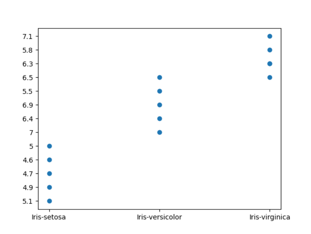
If we run this though, we'll get something pretty weird...
 Clearly, this isn't right. You can look at the y axis to see that the numbers don't follow any meaningful order!
This is because at the moment, pyplot is plotting strings in the y axis, and not numbers. Therefore it can't know where the maximum or minimum is. Every point in the plot gets a new tick in the y axis, and we can glean absolutely nothing from this graph.
So let's use comprehensions to fix this problem, by turning every piece of data into a float:
...

def handle_chart():
    column = int(input(charting_menu))
    x = read_column(-1)
    y = [float(n) for n in read_column(column)]
    create_chart(x, y)

...
Note that we could use map instead, and the code would be slightly shorter. Feel free to use whichever version you prefer.
This is the version using map:
...

def handle_chart():
    column = int(input(charting_menu))
    x = read_column(-1)
    y = map(float, read_column(column))
    create_chart(x, y)

...
We don't have to turn the x axis into numbers because at the moment those are the names of the species.
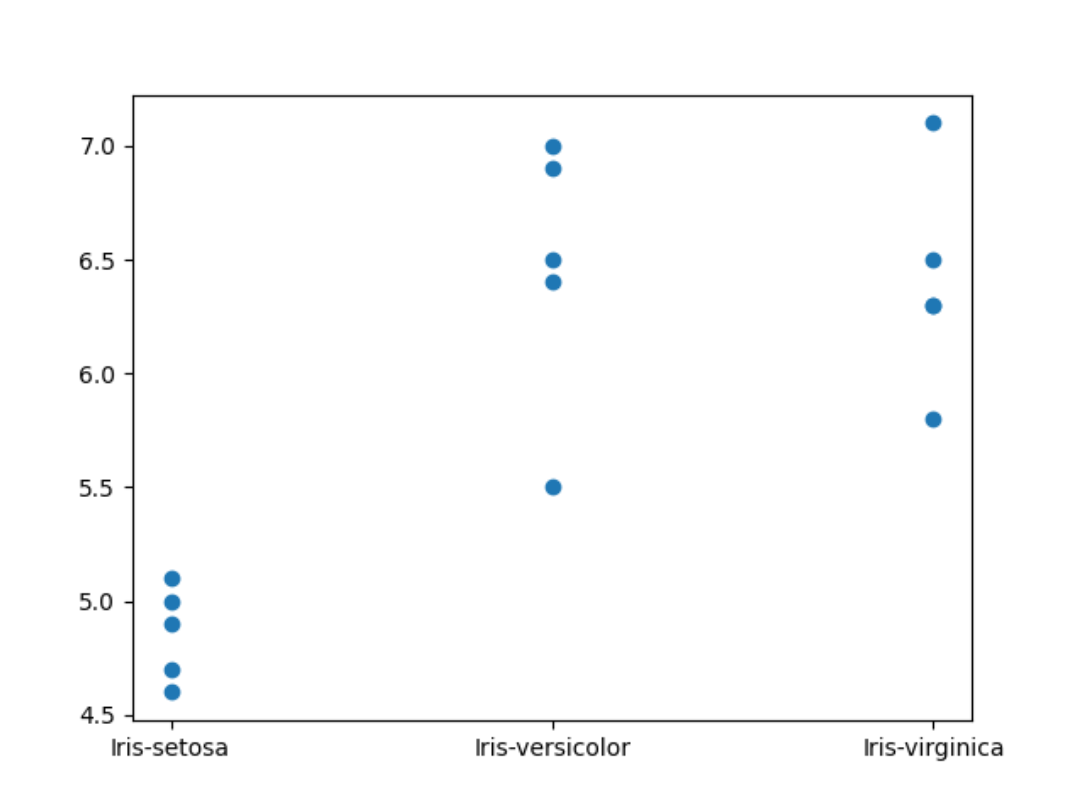
Now that's more like it!
 Interestingly, there's only 4 points for
 Iris-virginica even though we know there's 5 rows of data in the file.
That's because two points have the exact same values.
To make this clearer, we could make the scatter points semi-transparent. That way, when there are two points in the same location, the point will be darker.
In charts.py, let's add a new keyword argument to .scatter:
from matplotlib import pyplot

def create_chart(x, y):
    pyplot.scatter(x, y, alpha=0.5)
    pyplot.savefig("graph.png")
Now the result is a bit clearer!
Creating multiple graphs
If we run the application right now and run through the chart-creation menu option twice:
Please choose from the following options:

- Enter 'c' to chart a new graph.
- Enter 'q' to quit.

Your selection: c
Enter the column you'd like to chart: 0
Please choose from the following options:

- Enter 'c' to chart a new graph.
- Enter 'q' to quit.

Your selection: c
Enter the column you'd like to chart: 1
Please choose from the following options:

- Enter 'c' to chart a new graph.
- Enter 'q' to quit.

Your selection: q
We'll see a limitation of the simple approach we've taken with pyplot:
Every time we use .scatter, pyplot adds the new points we're plotting to the same chart. So the first time we create a new graph, it's all good.
The second time though, the points are added to the previous graph, instead of replacing the previous graph.
To fix this, we need to tell pyplot that every time we're creating a graph, it should create a new figure.
In charts.py, we can make this small change:
from matplotlib import pyplot

def create_chart(x, y):
    fig = pyplot.figure()
    pyplot.scatter(x, y, alpha=0.5)
    fig.savefig("graph.png")
Now we create a new figure with pyplot.figure(). Then, pyplot will automatically "select" it and draw the new scatter chart there.
When we do fig.savefig(), it saves that figure and not the old ones.
Allowing users to name the output file
The final requirement of our project is to allow users to name the output file!
We must ask the users for their desired file name before we run create_chart(), and we must also pass that name to the function as an argument.
First, let's modify create_chart():
from matplotlib import pyplot

def create_chart(x, y, filename):
    fig = pyplot.figure()
    pyplot.scatter(x, y, alpha=0.5)
    fig.savefig(f"{filename}.png")
Here I'm going to assume that users will give me a filename, and I'll add .png at the end of it. That way, we make sure that we only ever save image files even if the user gives us a ridiculous name like chart.txt.
Note that's ridiculous because we can't put images inside .txt files!
Now, let's go to our menu and ask users for their desired file name:
...

filename_prompt = "Enter your desired file name: "

def handle_chart():
    column = int(input(charting_menu))
    x = read_column(-1)
    y = [float(n) for n in read_column(column)]

    filename = input(filename_prompt)
    create_chart(x, y, filename.strip())

...
And with that, we're done!
This was a substantially trickier and more complicated project, but I hope you were able to work through some of this yourself. All that matters is that you give it a good go!
You can check the final code here. Remember, if you want an extra challenge, you can tell users which columns are available so they can pick from them instead of just typing a number.
If you have any questions about our implementation, please join our Discord server. We'd be more than happy to help!
See you tomorrow!